
Project Overview
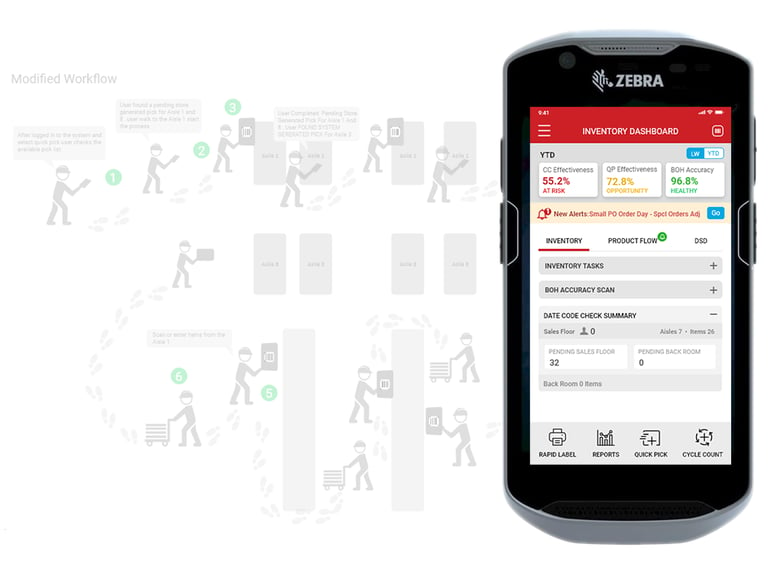
CVS store colleagues relied on multiple legacy apps on Zebra devices, forcing frequent app switching, scattered data access, and unnecessary trips between the sales floor, back room, and aisles during inventory tasks. Our goal was to streamline the experience by redesigning key inventory workflows, improving efficiency, simplifying daily tasks, and establishing reusable design patterns for future applications.
Reimagining the Colleague Experience - Ironman Inventory Apps
Client
CVS
Duration
1 Year
Role
UX Designer and Researcher
Platform
Handheld
Tools Used
Adobe CC, Adobe XD, Figma, Miro
The Challenge
Store colleagues relied on multiple legacy inventory applications, forcing them to switch between apps and make repeated trips across the store, which slowed operations and reduced overall efficiency.
Understanding the Problem Before Designing the Solution
................................................................................................................................................................................................................
Colleagues struggled to access the right information quickly, experienced interrupted workflows due to constant app switching, and spent unnecessary time walking between the sales floor and back room.
The solution had to work within the limitations of Zebra handheld devices, integrate with existing CVS systems and be delivered within a tight implementation timeline. Design an intuitive, accessible experience for store colleagues aged 18–80, accommodating diverse digital skills, physical abilities, and varying levels of job experience.
STORES NATIONWIDE
9,000+
Business Problem
User Problem
Constraints
300K
STORE COLLEAGUES
The Goal
Designing for Users. Delivering for Business
................................................................................................................................................................................................................
Design a unified, easy-to-use inventory experience on Zebra handheld devices that reduces app switching, simplifies daily tasks, and provides a reusable foundation for future inventory applications.
Measure success through reduced task completion time, fewer app switches, less walking during inventory processes, improved user satisfaction, and increased operational efficiency.
Project Goals
Success Metrics
The Process
Turning Research and Ideas into Meaningful Experiences
................................................................................................................................................................................................................
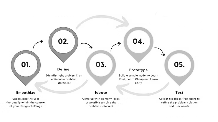
Through the Design Thinking process, we:
Empathized with store colleagues by observing their daily inventory tasks.
Defined the key pain points, such as frequent app switching, scattered information, and excessive walking.
Ideated multiple solutions through workshops and brainstorming.
Prototyped new workflows and interfaces.
Tested the designs with users and refined them based on feedback.
................................................................................................................................................................................................................
The Discovery
Exploring Needs, Behaviors, and Opportunities
................................................................................................................................................................................................................
Collaborated with business and product stakeholders to understand operational challenges, business goals, and modernization priorities for inventory workflows.
Interviewed multiple business users through informal discussions to understand current processes, modernization opportunities, device feasibility, and key pain points
Observed colleagues using Zebra devices in-store, revealing frequent app switching, repetitive walking, and interruptions during inventory tasks.
Analyzed 100+ Colleague Connect comments to identify user pain points, enhancement ideas, and opportunities for UX improvements.
Users constantly switched between multiple apps, walked repeatedly between the sales floor and back room, and struggled with complex navigation.
Conducted an expert review using Nielsen’s 10 Usability Heuristics to identify usability issues, workflow challenges, and navigation improvements.
Stakeholder Interviews
User Interviews
User Observation
Survey
Feedback
Outcome
Expert Review
Key Insights
Reviewed 1,000+ NPS survey comments to identify user pain points and establish a baseline for overall experience.
Pain Points
Fragmented applications, excessive footsteps, repetitive aisle walking, poor wayfinding, and difficult one-handed operation reduced productivity.
Opportunities
Create task-based workflows, consolidate applications, introduce contextual navigation, improve thumb-friendly interactions, add bottom navigation and search, support gestures, and provide coachmarks to simplify onboarding and improve efficiency.
Phase Define
Transforming Insights into Clear Design Directions
................................................................................................................................................................................................................
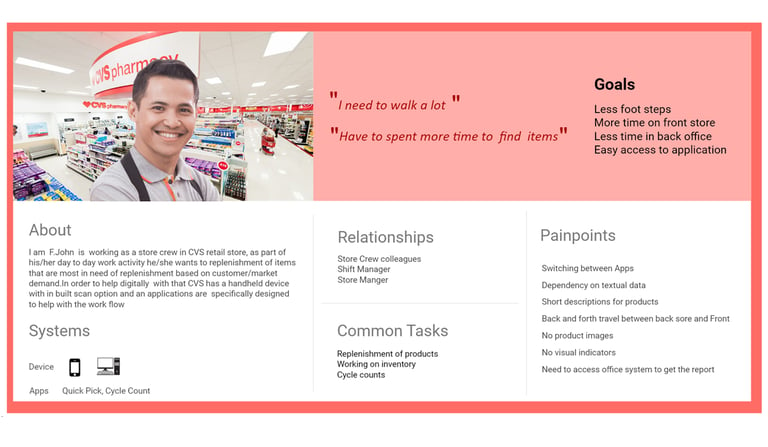
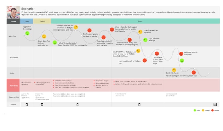
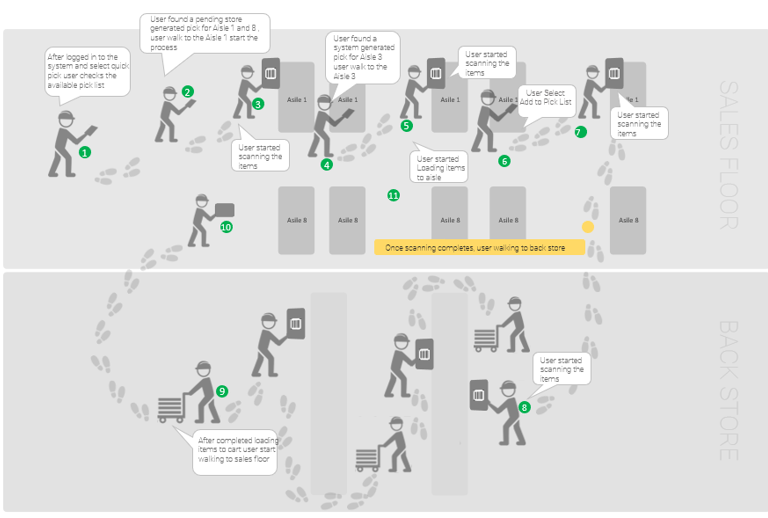
Personas
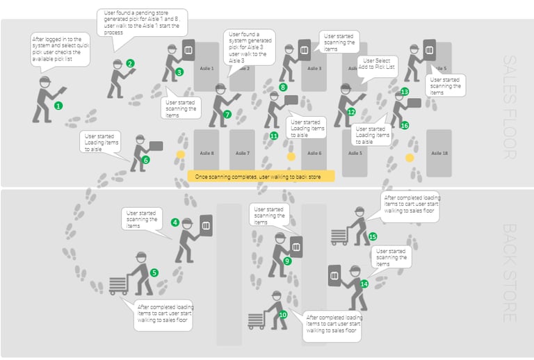
User Journey Map
Reduce Apps + Taps
Modified work flows to reduce footsteps between the sales floor and the back room and repetitive aisle walking, by creating task based flows with aisle card navigation. We also reduced back and forth app switching by reducing the number of apps into focused groupings. By simplifying and creating ease of use and easier wayfinding with contextual menus, their most common tasks are available from relevant pages in the moment they need them.
Design for Thumbs
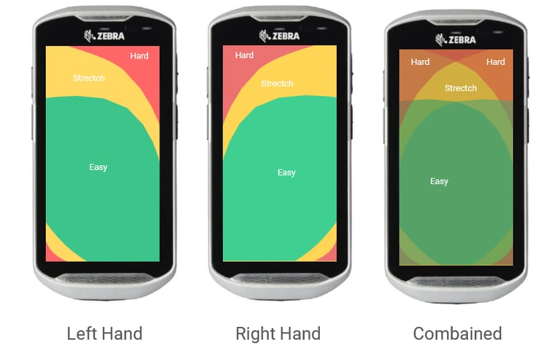
Design for Thumbs
User interact with Zebra CT touchscreen devices using thumbs, so keeping all important navigational elements within comfortable reach is critical.
Fat-Finger Friendly
Improved Accessibility
Use advanced Input Controls More gestures
................................................................................................................................................................................................................
................................................................................................................................................................................................................
................................................................................................................................................................................................................
Phase Ideate
Generating Ideas That Solve Real User Problems
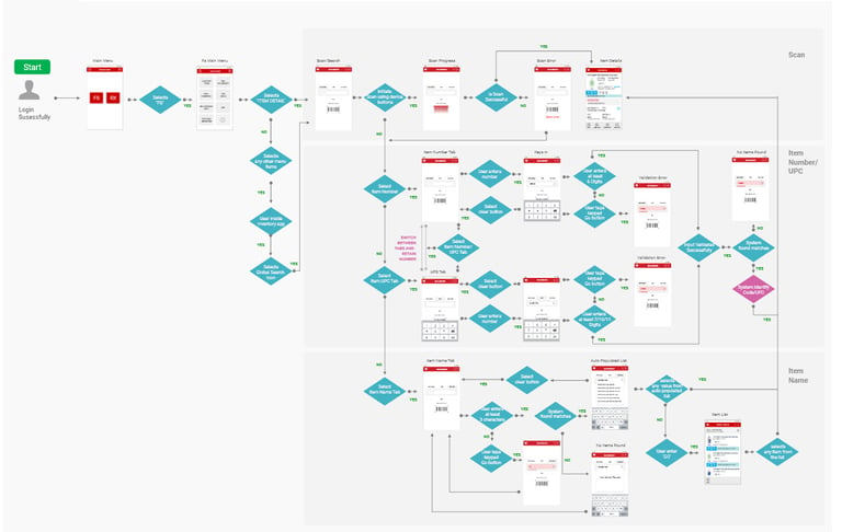
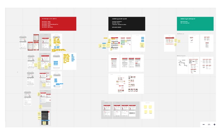
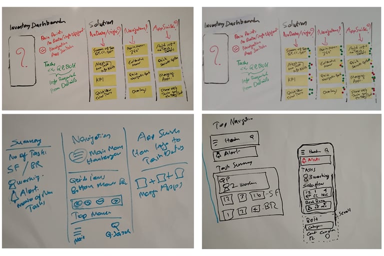
We conducted collaborative design workshops with key stakeholders and team members to understand existing inventory processes, identify pain points, and explore opportunities for improvement. Through journey mapping, workflow analysis, and brainstorming sessions, we identified unnecessary steps, app switching, and repeated movements between the sales floor and back room. Based on these insights, we redesigned and simplified the user flow by consolidating tasks, reducing dependencies on multiple applications, and creating a more guided workflow that helps colleagues complete inventory activities faster and with less effort. The modified flow became the foundation for a more intuitive and efficient inventory experience.
Design Workshop & Modified User Flow
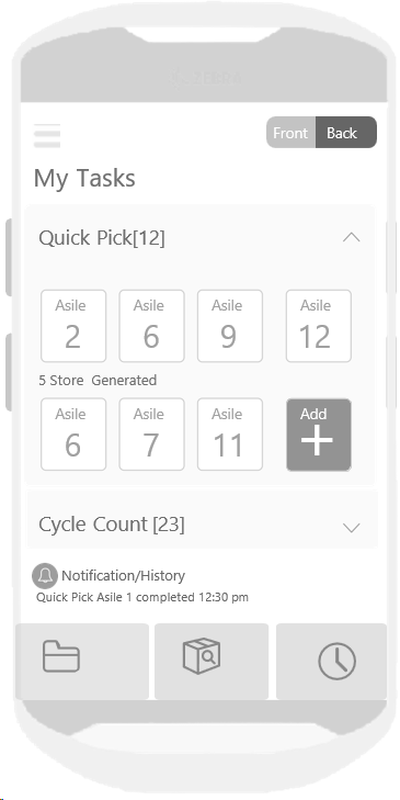
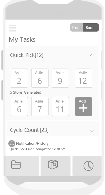
White Boards and Initial Concepts
Phase Prototype
Transforming Concepts into Testable Solutions
................................................................................................................................................................................................................
”Too many trips between the front and back of the store to accomplish these tasks, and too much app switching.”
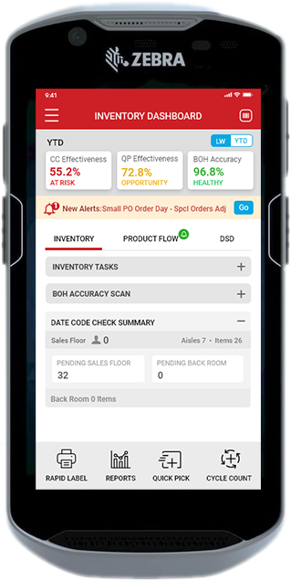
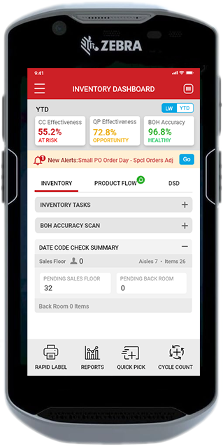
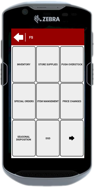
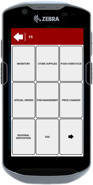
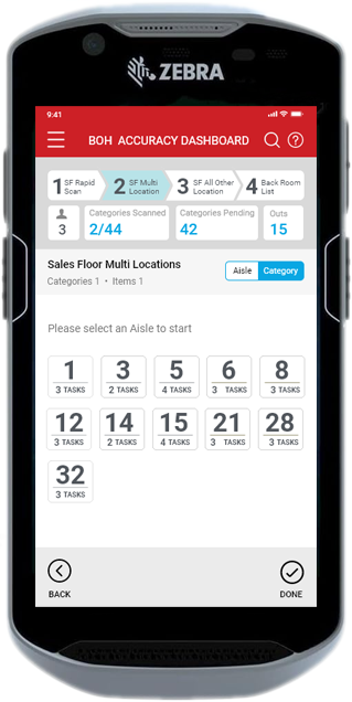
Developed a wizard approach so that the user knows which step they are on. As a new concept, the BOH Accuracy Scan Dashboard shows the number of categories scanned and those which have not had any outs scanned yet so they don’t need to go to the back room to print out a report.
Before
Solution
Result
Before
Solution
Result
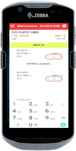
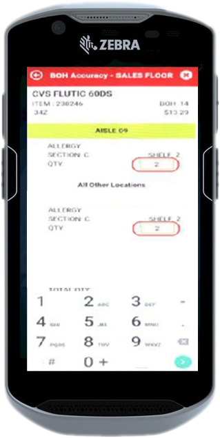
“BOH has too many steps and we don’t know which have bcategorieseen scanned and which haven’t when we are on the floor scanning.”
Tasks are grouped by Aisle and Sales Floor/ Back Room to prevent repetitive walks down the same aisle for different processes like Quick Pick and Cycle Count.
Common actions like printing no longer require app switching, and users can accomplish them in less than 2 taps.
The card pattern used can accommodate other types of tasks as CVS folds other Ironman Apps Into the Dashboard concept.
................................................................................................................................................................................................................
Before
Solution
Result
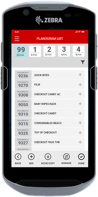
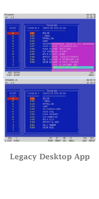
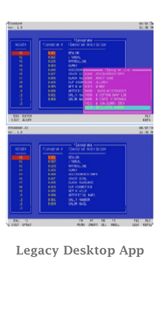
“Managing planograms /aisles requires us to go to the back office and use an old legacy application, but we really really need this functionality on the handheld when we are on the sales floor.”
Dragging and dropping planograms into aisles to move them and sequence them within their aisles is easy, and adding and deleting aisles is < than 2 taps away. This app will be used for New Store Setup too. Searching for a specific planogram by number or description is simple and can even be done by scanning an item when walking through an aisle.
................................................................................................................................................................................................................
Phase Test
During the testing phase, we validated the redesigned inventory experience with store colleagues to ensure the workflows were intuitive, efficient, and easy to use. User feedback and observations helped us identify areas for improvement and refine the experience for a diverse range of users.
Tested common inventory tasks using interactive prototypes with store colleagues.
Observed user interactions to identify usability challenges and workflow gaps.
Gathered feedback to improve navigation, task flows, and overall usability.
Refined designs to support colleagues across different age groups and digital skill levels.
Optimized the final experience to reduce effort, improve accuracy, and increase efficiency.
Learning from Users to Improve the Design
The Results
Simplified inventory workflows by reducing app switching and eliminating unnecessary steps.
Turning Design Decisions into Real-World Impact
Improved colleague efficiency by reducing travel time between the sales floor, back room, and aisles.
Established reusable design components and patterns to support future inventory application enhancements.
Created a more intuitive Zebra handheld experience that supports users across different age groups and skill levels.
Consolidated information into task-focused flows, making daily inventory activities faster and easier to complete.
60%
50%
2 Taps
3 Apps
50%
Enabled colleagues to complete tasks 60% faster
Cut unnecessary travel between sales floor and back room by 50%
Improved efficiency by reducing the number of taps from 6 to 2
Consolidated 7 applications into 3 streamlined experiences
Improved development efficiency by reducing effort by 50%
................................................................................................................................................................................................................
What I Learned
This project reinforced the value of a user-centered approach in solving complex business challenges. By understanding user behaviors, simplifying workflows, and collaborating with stakeholders, I learned how thoughtful UX decisions can create efficient, accessible, and scalable experiences.
Understood the importance of studying real user behaviors and challenges before creating solutions.
Learned how simplifying workflows can improve operational efficiency and user satisfaction.
Gained insights into balancing simplicity, accessibility, and speed for diverse users.
Strengthened collaboration skills by translating complex business processes into intuitive experiences.
Lessons That Continue to Influence Better Experiences
................................................................................................................................................................................................................
The Showcase
Showcasing the Building Blocks Behind Better Experiences
A collection of UX artifacts that showcase my approach to understanding users, defining problems, exploring solutions, and creating meaningful experiences.
I Continue to Evolve
I constantly explore emerging technologies, AI-powered design, accessibility, and evolving UX practices to create better experiences. Every project expands my knowledge, every user offers new insights, and every challenge inspires better design.
Design is a continuous journey of learning and improvement.